Apple has officially rolled out iOS 26, and while the update brings several new features, the most talked-about change is the new Liquid Glass design. This fresh interface introduces a sleek, translucent look that blends elements seamlessly across the system. However, as with most major design overhauls, it has left iPhone users divided—some praising its futuristic aesthetics, while others feel it’s distracting or hard to read.
What Is the Liquid Glass Design?
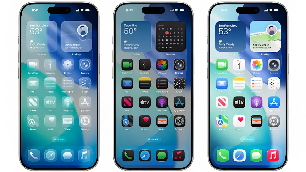
The Liquid Glass interface gives apps, menus, and widgets a translucent appearance, mimicking the smooth clarity of glass. Apple aimed to create a more immersive and modern experience where background colors subtly influence the display elements. For many, this makes the iPhone feel more polished and premium. But for others, the transparency feels excessive, making it harder to focus on content.

User Reactions – Mixed Opinions Across the Internet
Ever since the Liquid Glass design was announced, online reactions have been split. Some users love the fresh, futuristic vibe, while others complain about legibility and eye strain. During the beta testing phase, Apple adjusted transparency levels based on user feedback, but the final version still leans heavily on the glass effect.

Can You Turn Off Liquid Glass?
Currently, there is no option to completely disable Liquid Glass in iOS 26 or iPadOS 26. However, Apple does allow users to reduce the effect. By going to Settings > Accessibility > Display & Text Size > Reduce Transparency, you can make the interface appear clearer and easier to read without entirely removing the new design.

Final Thoughts
While Liquid Glass is one of Apple’s boldest design updates in years, it’s not for everyone. The good news is that with small tweaks, iPhone users can adjust the experience to suit their comfort. Whether you love it or not, Liquid Glass is here to stay—at least for now.